Press kit
Use the assets below to refer to BeastLab AI in articles, partner pages, presentations, and integrations. Everything here ships as vector SVG alongside the raster files, and in three colourways: brand for light backgrounds, mono for a single ink, and duo for dark backgrounds. Please use the unmodified files: do not stretch, recolor, add effects, or combine the artwork with other logos in a way that implies endorsement or partnership we have not confirmed.
Usage guidelines
- Prefer the SVG files. Every asset is now published as vector; fall back to PNG only where a surface cannot take an SVG.
- Keep clear space around the logo equal to at least the height of the “B” in BEASTLAB.
- The full mark needs roughly 64 px to stay legible. Below that, its nineteen elements crowd into each other; use the seven-hexagon cluster instead, as the 16 and 32 px favicons do.
- Do not set the plain wordmark below about 120 px wide, or the stacked and one-line cuts below 150 px — the “AI” goes illegible first.
- Prefer the transparent PNG variants for digital and web use; use the JPG variant only for print or photo workflows where transparency cannot be preserved.
- On dark or busy surfaces, use the knockout files rather than dropping the brand-colour artwork onto a dark plate.
- Do not crop the full lockup in a way that removes the wordmark; use the dedicated “mark only” asset instead.
- Do not recolor the artwork. The three colourways below are the only approved color treatments.
Download everything
If you just want the files, take one of these. Every asset shown further down this page is inside the press kit, along with a README.txt describing the folders — worth a look, because the kit carries three icon sets that look interchangeable and are not. The favicon package below skips that decision: it is already narrowed to the set this site installs.
Favicon package
Download ZIPFull lockup
The primary lockup: the hexagon lattice mark together with the BEASTLAB AI wordmark. Use the horizontal version as the default brand representation; use the square version where you need a stacked or badge-shaped layout. These are the brand colourway, drawn in dark ink for light backgrounds.
Horizontal lockup
Download SVG
Horizontal lockup
Download PNG
Horizontal lockup (photo use)
Download JPG
Square lockup
Download SVG
Square lockup
Download PNG
Square lockup (photo use)
Download JPGMark
Seven pointy-top hexagons arranged as a hexagon, ringed by twelve discs in three sizes, with hairline connectors joining the upper-left hexagon to the centre one and the centre to the upper-right — linked nodes signalling each other. Use it on its own for app icons, avatars, and tight spaces. The PNG variants have a fully transparent background; the JPG is provided for contexts where transparency cannot be preserved.
Mark
Download SVG
Mark, transparent
Download PNG
Mark, transparent (web)
Download PNG
Mark (photo use)
Download JPG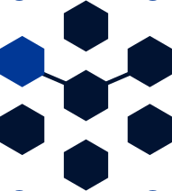
Mark, icon form
Download SVGThe last of those is the seven hexagons on their own, with the ring of discs dropped. It is what the 16 and 32 px favicons are cut from, and the file to reach for wherever the guidelines above say the full mark is too small to hold together. The -mono and -duo colourways of it are in the ZIP.
Wordmark
BEASTLAB is drawn, not typed. Every “A” is a chevron with no crossbar and a small pointy-top hexagon floating in the void beneath its apex, which ties the letterform back to the lattice. No font will reproduce it, so set the name from these files rather than typing it. Three cuts: plain is BEASTLAB on its own and is what the header and footer of this site use; the stacked version places “AI” below the name between two hairline rules; the one-line version places a smaller “AI” to the right of it. Use plain wherever the surrounding context already says what the company does, and one of the other two where the logo has to stand alone.

Wordmark, plain
Download SVG
Wordmark, plain
Download PNG
Wordmark, plain (photo use)
Download JPG
Wordmark, stacked
Download SVG
Wordmark, stacked
Download PNG
Wordmark, stacked (photo use)
Download JPG
Wordmark, one line
Download SVG
Wordmark, one line
Download PNG
Wordmark, one line (photo use)
Download JPGKnockouts for dark surfaces
Light-ink artwork on a transparent background, for dark or busy surfaces. Mono is a single ink, #EEEAE5, and holds up over anything. Duo pairs #EEEAE5 letterforms with #00DCFF accents, and is the version to reach for on a dark plate — this site uses it nowhere itself, because the surfaces that carry the logo are light. Matching -duo.svg and -mono.svg vector files for all three shapes are in images/brand/svg/.
Square lockup, duo
Download PNG
Square lockup, mono
Download PNG
Horizontal lockup, duo
Download PNG
Horizontal lockup, mono
Download PNG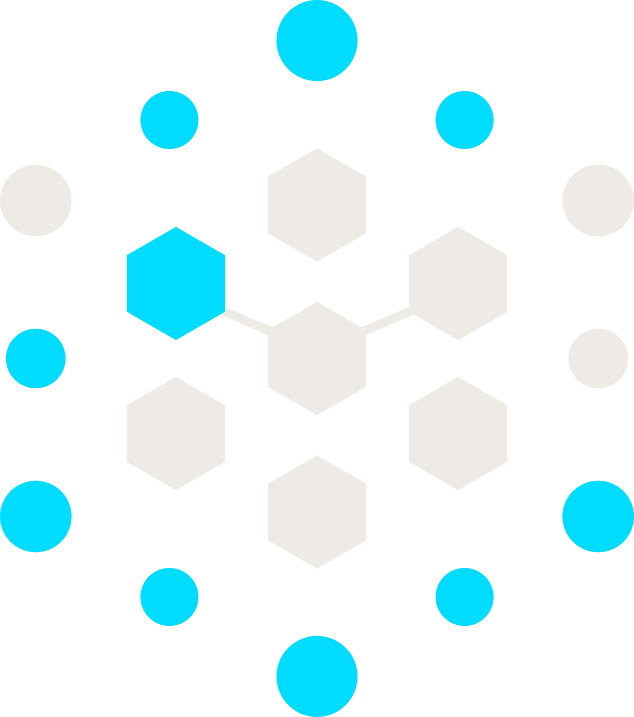
Mark, duo
Download PNG
Mark, mono
Download PNGApp icons & favicons
The icons this site installs. Each one is the brand-colourway mark on an opaque #EEEAE5 plate — the same colourway and the same paper as the site header, so the tab icon and the page it opens are recognisably one logo. The plate is what makes that safe: on transparency the navy ink would disappear against a dark tab strip, whereas on its own plate it holds at 15:1 whatever the browser chrome is doing. They are previewed on black below for exactly that reason.
The 16 and 32 px icons drop the outer discs and show only the seven-hexagon cluster, because the full mark’s nineteen elements go illegible below about 64 px. The whole pack plus site.webmanifest is in the favicon ZIP above; a duo-colourway variant on a #02060C plate, for dark app UIs, is in the full press kit under favicon-dark/.
Android icon, 512px
Download PNG
Android icon, 192px
Download PNG
Apple touch icon
Download PNG
Favicon, 32px
Download PNG
Favicon, 16px
Download PNG
Favicon (ICO)
Download ICOColour
Five values cover the three colourways. Do not substitute them, and do not sample colours out of a compressed JPG.
#011332— dark ink. The primary colour of the brand colourway, and the default for light backgrounds.#013896— accent ink. The second colour of the brand colourway; it carries one hexagon and most of the outer discs. This is also the accent colour of this website — buttons, links and focus rings are all drawn in it, lightened to#649CFFwhere they fall on a dark band and the ink itself would not carry.#EEEAE5— light ink. The single colour of the mono colourway, and the letterforms in duo. It is also stone paper, the surface this site is built on, and the plate behind its app icons.#00DCFF— cyan. The accent in the duo colourway and in the app icons, which are drawn on forge black. It belongs to that colourway only; nothing else on the site uses it.#02060C— forge black. The background duo is drawn against, the site’s dark bands, and the plate behind thefavicon-dark/icon variant.
Press contact
For interviews, embargoed announcements, or assets you cannot find here, email [email protected] or use the contact form.